> For the complete documentation index, see [llms.txt](https://ticketking.xyz/docs/llms.txt). Markdown versions of documentation pages are available by appending `.md` to page URLs; this page is available as [Markdown](https://ticketking.xyz/docs/panels/edit-a-dropdown-menu.md).
# Edit a dropdown menu
Dropdowns with up to 25 options, for when buttons are not enough. Each option has its own per-option settings.
A **dropdown menu** is a collapsed list. Members click, the list opens, they pick. The chosen option opens a ticket.
A dropdown menu fills a whole component row. A panel has up to 5 rows, so a panel can have **up to 5 dropdown menus** (one per row). You can also mix dropdown menus with button rows in the same panel.
## When to use a dropdown menu vs buttons
You are not forced to choose a dropdown menu just because you have many options. A panel can hold up to 5 rows of up to 5 buttons, so you can put up to 25 buttons on one panel. A dropdown menu is the better choice when you want a single tidy list instead of a wall of buttons, when your options are closely related and read well as one list, or when each option benefits from a short description under its name.
| Use a dropdown menu when... | Use buttons when... |
| ---------------------------------- | ----------------------------------------- |
| You want one grouped dropdown list | Each option should be visible at a glance |
| The options are closely related | Some options need visual prominence |
| Each option needs a description | A simple label is enough |
| You want to keep the panel compact | You only have a few options |
You can mix the two in the same panel: a Primary button for the most common action plus a dropdown menu for the longer list of topics.
## Dropdown menu fields
### Placeholder
The grey text shown when the dropdown is closed. *"Choose a topic..."*, *"Pick a category"*. Up to **100 characters**.
### Options (the list)
Up to **25 options** per menu.
Each option has:
| Field | Cap |
| --------------- | ----------------------------------------------------------------- |
| **Label** | 100 characters. What members see. |
| **Value** | 100 characters. Internal identifier (auto-filled from the label). |
| **Description** | 100 characters. Small grey subtitle, optional but recommended. |
| **Emoji** | Optional. Same picker as buttons. |
| **Default** | Toggle. Pre-selected when the dropdown opens. |
## Each dropdown-menu option is also an option
Just like buttons, each entry in the dropdown menu has the same set of per-option settings that control what happens when a member picks that option:
* **Option Status.** Enabled or Disabled.
* **Ticket Style.** Text Channel or Thread per option.
* **Support Roles.** Who gets added and (with pings on) pinged.
* **Custom Category.** Where this option's tickets land.
* **Custom Ticket Name.** How this option's channels are named.
* **Custom Embed Content.** A per-option embed shown inside the ticket. Free.
* **Form questions.** Up to 5 questions before the ticket opens, or up to 100 with multi-step forms on Premium.
* **Required Roles / Blocked Roles** (:crown: Premium). Gate who can use this option.
* **Steam ID Integration** (:crown: Premium). Require Steam linking first.
For every per-option setting in detail, see:
{% content-ref url="/pages/aHGH6BOJh48aZHUVoiWW" %}
[Per-option settings](/docs/panels/per-option-settings.md)
{% endcontent-ref %}
→ [What option questions are (form questions)](/docs/forms/what-option-questions-are.md)
## Editing a specific option
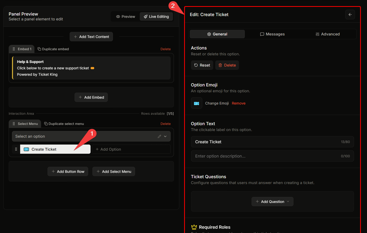
Click the option in the panel preview to open its editor in the right pane. The per-option settings tabs (General, Messages, Advanced) appear, the same as for button options.
## Adding / removing options
In the panel editor's dropdown-menu section, **+ Add Option** appends a new entry. The red trash icon next to an option removes it.
{% hint style="danger" %}
**Removing an option does not close currently-open tickets** opened from it. Only future ticket openings are affected.
{% endhint %}
## Related
{% content-ref url="/pages/aHGH6BOJh48aZHUVoiWW" %}
[Per-option settings](/docs/panels/per-option-settings.md)
{% endcontent-ref %}
{% content-ref url="/pages/26CaDdu7xwN1Wh12EuWh" %}
[Edit a button](/docs/panels/edit-a-button.md)
{% endcontent-ref %}
---
# Agent Instructions
This documentation is published with GitBook. GitBook is the documentation platform designed so that both humans and AI agents can read, navigate, and reason over technical content effectively. Learn more at gitbook.com.
## Querying This Documentation
If you need additional information that is not directly available in this page, you can query the documentation dynamically by asking a question.
Perform an HTTP GET request on the current page URL with the `ask` query parameter, and the optional `goal` query parameter:
```
GET https://ticketking.xyz/docs/panels/edit-a-dropdown-menu.md?ask=&goal=
```
`ask` is the immediate question: it should be specific, self-contained, and written in natural language.
`goal` is optional and describes the broader end goal you are ultimately trying to accomplish on behalf of the user. GitBook uses it to tailor the answer towards what is most useful for that goal.
The response will contain a direct answer to the question and relevant excerpts and sources from the documentation.
Use this mechanism when the answer is not explicitly present in the current page, you need clarification or additional context, or you want to retrieve related documentation sections.